CHAPTER 5: PROGRESSIVE ENHANCEMENT FOR ACCESSIBILITY
“It takes many good deeds to build a good reputation, and only one bad one to lose it.”
In February of 2006, the National Federation of the Blind took legal action against Target for having an inaccessible website. A month later the case went to federal court (at Target’s request). Target tried to get the case thrown out, but it didn’t fly and the case turned into a class action lawsuit that Target eventually settled in 2008 for over $6 million US (not counting attorney fees). That’s pretty substantial considering that the reason the lawsuit was filed in the first place was because Target didn’t fix accessibility issues they were alerted to: lack of alt text on images, heavy use of image maps, and reliance on a mouse for the submission of forms. All of these issues could have been addressed quickly and easily for far less than $6 million. Hell, I’d have done it for a few grand.
If you haven’t had a lot of exposure to accessibility—with respect to this chapter, a measure of how well a site can be used by people with disabilities and the assistive technologies[1] they rely on—as a design consideration, it can seem incredibly daunting because there are so many factors to consider. Even if you fall into a category of users with “special needs,” it’s likely your experience and aptitudes are different from someone else with similar concerns. For example, you may have deuteranopia (a type of red-green color blindness), but yours may not be as extreme as someone else’s. You also may not be as likely to recognize potential issues for people with tritanopia (blue-yellow color blindness).
If you’re the kind of person who is concerned with issues of accessibility, whether from the position of getting your message to as many people as possible or because you don’t want to make someone feel left out, the self-imposed pressure to “get it right” can seem so intense that you can’t help but approach it with trepidation.
Thankfully, designing and developing with progressive enhancement improves accessibility. Progressive enhancement encourages you to build your websites in service of the content and that, more often than not, will help guide you toward the right decision when it comes to accessibility. Of course there’s always room for improvement, hence this chapter.
NOW YOU SEE ME…
Perhaps the most heavily-repeated pattern in JavaScript-based page manipulation is showing and hiding content. Tabbed interfaces. Collapsible elements. Accordion widgets. It crops up nearly everywhere. In and of itself, this pattern is not a bad thing, but few people realize how profoundly your choice of hiding mechanism can influence the accessibility of your content to assistive technologies like screen readers.
When it comes to hiding content, there are several mechanisms for doing it and each has a different affect on the page, as summarized in the table below.
| CSS RULES |
DISPLAY EFFECT |
ACCESSIBILITY EFFECT |
|---|---|---|
visibility: hidden; |
Element is hidden from view, but is not removed from the normal flow (i.e., it still takes up the space it normally would) | Content is ignored by screen readers |
display: none; |
Element is removed from the normal flow and hidden; the space it occupied is collapsed | Content is ignored by screen readers |
height: 0; width: 0; overflow: hidden; |
Element is collapsed and contents are hidden | Content is ignored by screen readers |
text-indent: -999em; |
Contents are shifted off-screen and hidden from view, but links may “focus” oddly and negative indent may not prove long enough to fully hide content | Screen readers have access to the content, but the content is limited to text and inline elements |
position: absolute; left: -999em; |
Content is removed from the normal flow and shifted off the left-hand edge; the space it occupied is collapsed | Screen readers have access to the content |
Table 5.1: Mechanisms for hiding content.
The first two mechanisms are probably the most popular, with display: none; being the go-to option implemented by nearly every JavaScript library on the planet and the lion’s share of ready-made JavaScript widgets. If you don’t want your hidden content to be read by a screen reader, those defaults may work for you, but if you want to ensure users have access to content (even if it isn’t displayed visually in the current interface), the final option is really the way to go.
If you roll your own JavaScript library, positioning content off-screen to hide it is pretty easy to implement. If, however, you are using a third-party JavaScript library, such as jQuery or Prototype, this task becomes much more difficult to accomplish because making the change requires overwriting or otherwise changing the internals of the library. Unless, of course, you’re smart about how you do it.
Most libraries include, as part of their animation suite, a mechanism for including what are referred to as “callback functions.” A callback function is a function that you supply to another function (or object method) so it can be called at a predetermined time. If you’ve used JavaScript to load content via Ajax, you’re probably familiar with the concept: callback functions are used to do something with the data you got back from the server.
In most cases, JavaScript libraries only offer a callback function that runs at the completion of a given activity, but some libraries also provide hooks for various other points during the execution of a given routine, such as before the routine begins. Even without additional callback hooks, however, it’s possible to create more accessible show/hide operations. Take the following jQuery-based snippet, for example:
(function(){
  var $button = $('#myButton'),
      $text = $('#myText'),
      visible = true;
  $button.click(function(){
    if ( visible ) {
      $text.slideUp('fast');
    } else {
      $text.slideDown('fast');
    }
    visible = ! visible;
  });
})();
This script finds two elements (#myButton and #myText), assigning them to two local variables ($button and $text, respectively) before setting a third local variable (visible) to track the current state of things. It then goes on to assign an onclick event handler to #myButton that toggles the visibility of #myText by adjusting its height. Pretty straightforward, right?
This script works as you’d expect, but jQuery currently uses display: none when you call slideUp(), so #myText is being hidden via a method that prohibits the hidden text from being read by a screen reader. By making a subtle tweak to the code, however, we can trigger the addition of a class we control that provides for a more accessible means of hiding content:
(function(){
  var $button = $('#myButton'),
      $text = $('#myText'),
      visible = true;
  $button.click(function(){
    if ( visible ) {
      $text.slideUp('fast',function(){
        $text
          .addClass('accessibly-hidden')
          .slideDown(0);
      });
    } else {
      $text.slideUp(0,function(){
        $text
          .removeClass('accessibly-hidden')
          .slideDown('fast');
      });
    }
    visible = ! visible;
  });
})();
This script is almost identical to the last one, in that when the content is being hidden, the library is allowed to manage the animation, but then the script swaps the default completion state for our custom class “accessibly-hidden,” thereby keeping the content available to assistive technologies. When the script goes to show the content, the steps are reversed, with the content being hidden by the script again before the class is removed and the actual animation is performed.
The added benefit of this approach is that you control the method of hiding content completely, as opposed to leaving it up to the JavaScript library. That means you can upgrade your “accessibly-hidden” class to use a different technique if something better comes along and you don’t have to wait for the library to upgrade its hiding mechanism (if it ever does).
Of course all of this assumes you want to hide content from being displayed, but you want to keep it available to older assistive devices. If, however, you don’t want the content to be read by a screen reader, you could use display: none, but it’s still not the best route to go because there’s no easy way to let the user know new content is available if you ever want to show that content. To really provide the best experience for you users, you’ll want to employ the roles and states defined in the Web Accessibility Initiative’s Accessible Rich Internet Applications spec (WAI-ARIA or ARIA, for short).[2]
Hiding content with ARIA is pretty straightforward: you simply employ the aria-hidden attribute.
<p aria-hidden="true">Guess what? I’m accessibly hidden using ARIA.</p>
ARIA offers a number of predefined roles, states, and properties that can be of tremendous use when building a JavaScript-heavy site. There are even a handful that are useful whether you are building a highly interactive application or not. We’ll tackle those first.
EMPOWER WAYFINDING
One of the many ways ARIA helps improve the accessibility of a web page is through the use of “landmark” and “structural” roles. Many of these roles formalize the significance we had been attempting to impart to elements for years via by applying semantic classifications and identifiers (as we discussed in Chapter 2). ARIA’s landmark and structural roles (and widget roles, which we’ll get to shortly) are assigned to an element using the role attribute.
I know, I know: role isn’t a valid attribute in HTML 4.x or XHTML 1.x. It’s true. ARIA adds a host of new attributes to the HTML lexicon, which means you won’t be able to validate your pages using the same old Document Type Definitions (DTDs) you’ve been using. If you want to validate your ARIA-infused pages in either of these two languages, you’ll need to use a different set of DTDs[3] or make the leap to HTML5 which supports attributes like role.
Here’s a quick example of ARIA in action:
<ol role="navigation">
  <li><a href="#details">Details</a></li>
  <li><a href="#schedule">Schedule</a></li>
  <li><a href="#instructors">Instructors</a></li>
  <li><a href="#lodging">Lodging</a></li>
  <li><a href="#location">Location</a></li>
</ol>
You should recognize this bit of markup from Chapter 2; it’s the navigation for the Retreats 4 Geeks page. The only difference between this and our original markup is that the ol now has a role attribute with a value of “navigation.” As you’d suspect, the ARIA landmark “navigation” role denotes that an element is acting as a navigational mechanism.
All of ARIA’s landmark roles convey information about regions of the page itself and are useful for overall page navigation. Some assistive technologies expose these landmarks to users, allowing them to directly move from region to region via keystrokes or other means. They are the logical successor to a bevy of “skip to” links.[4] Structural roles, on the other hand, act as organizational tools akin to HTML5 elements like section and article.
You may recall that, in the original example, we wrapped the navigational ol in a new HTML5 element: nav. If you are really on the ball, you’ll also recall that using the nav element is semantically-equivalent to employing the landmark role “navigation.” And this isn’t the only area of overlap between HTML5 and ARIA.
Redundancy and reason
These two specs developed independently over roughly the same time period and each sought to address the pressing problems they saw with the current state of HTML. (Hence, the inevitable overlap.) The ARIA spec is currently a bit closer to becoming a recommendation than HTML5 is and, as a consequence, many of its unique features are being incorporated into HTML5 as that spec continues to develop. When HTML5 finally reaches the Candidate Recommendation stage, it’s pretty safe to assume that the two specs will have been successfully merged and that redundancies will have been ironed out.
For the time being, however, there is a considerable amount of overlap between ARIA and HTML5, especially in the case of structural and (to a lesser extent) landmark roles. Table 5.2 provides a few examples of our traditional ad-hoc semantics, their equivalent ARIA role, and the HTML5 element (if any) that serves the same purpose.
| AD-HOC SEMANTICS |
ARIA ROLE |
HTML5 ELEMENT |
SEMANTIC MEANING |
|---|---|---|---|
#header, #top |
banner | header (kind of) |
A region of the page that is site-focused, rather than page-focused |
#main, #content |
main | none | The focal content in a document |
#extra, .sidebar |
complementary, note | aside |
A supporting section of the document that is related to the main content (“complementary” content remains meaningful when separated from it) |
#footer, #bottom |
contentinfo | footer |
A region that contains information about the document |
#nav |
navigation | nav |
A region of the page containing navigational links |
.hentry |
article | article |
A region of the page that forms an independent part of the document |
Table 5.2: Traditional ad-hoc semantics, their equivalent ARIA role, and the HTML5 element (if any) that serves the same purpose.
At present, there is a bit of back-and-forth between the HTML5 community and accessibility advocates over what to do about the redundancy. From a practical standpoint, even if you are using HTML5’s ARIA-equivalent semantics it’s generally considered a good idea to double up with the ARIA landmark roles because not all assistive technologies are HTML5-aware yet. Structural roles, however, can be assigned at your own discretion as they are purely organizational and are not currently exposed to users via assistive technology.
A quick scan of the Retreats 4 Geeks source code will reveal this redundancy on the nav and footer elements. As assistive technologies are updated to be HTML5-compatible, however, we will be able to jettison the unnecessary role attributes and streamline our markup a bit more.
In addition to overlap with HTML5, there are quite a few roles that duplicate the semantics long available in HTML. Consider the following ARIA landmark and structural roles: columnheader, definition, form, heading, img, list, listitem, row, rowheader, and separator. Some of those have one-to-one equivalencies in HTML (e.g., “form”) and the others are a more generalized form of what we have in HTML (e.g., “list”).
While it’s understandable that the parallel development of ARIA and HTML5 would create some overlap, you may be scratching your head over why ARIA would seem to recreate semantics that have existed in HTML for over a decade. The simple answer is that, for one reason or another, some companies (<cough>Google</cough>) like to use non-semantic markup (e.g., divs) as the basis for an interface and use JavaScript to make it function like a native HTML control. For that reason alone, ARIA provides overlapping roles. You won’t see me running out to give a div a role of “form” (I’ll just use a form, thank you), but to each his own I guess.
As we discussed earlier, the Retreats 4 Geeks site implements several of the HTML5 elements that are semantically-equivalent to ARIA’s landmark and structural roles—nav, footer, article—but we’ve opted to include the equivalent ARIA roles in the interest of serving the greatest number of users. (After all, that’s what progressive enhancement is all about, right?) We’re not done though. As we saw in Table 5.2, the semantic equivalence of an ARIA role of “banner” to HTML5’s header is somewhat debatable so, to be absolutely clear in the service of our users, I’ve added that role as well:
<header role="banner">
The only other role we haven’t touched on (since it’s currently not addressed in HTML5) is “main,” which indicates the focal content of the document. You may recall from Chapter 2 that I chose a section element to enclose the various articles on the page and that it was also the element I chose to act as the root of our hCalendar; that section just screams “main” to me:
<section id="content" class="vevent" role="main">
And with those two minor adjustments, we’ve covered every landmark role that seems sensible to employ on the Retreats 4 Geeks site. Not only that, but we’ve improved the overall accessibility of our page by providing easy ways for users of assistive technology to move around the document.
BROTHER CAN YOU SPARE A CLUE?
In addition to providing users with a means to find their way around a document, the ARIA spec prescribes other helpful tools as well, not the least of which is its collection of widget roles and states.
Widget roles do just what you’d expect them to: describe the role of a given element. These roles are generally divided into two camps: roles that provide a defined structure, and those that don’t. Or, more simply, containers and components. Containers are the elements that house the components of a given widget.
Consider the tabbed interface shown in Figure 5.1. A tabbed interface is constructed from two component parts: a list of tabs and a collection of panels shown by those tabs. Those parts break down into three separate roles in the ARIA spec: the tabs themselves have a role of “tab,” the list of tabs has a role of “tablist,” and each panel is assigned a role of “tabpanel.” In terms of designations, both “tab” and “tabpanel” are considered component roles, while “tablist” is considered a container role (because it contains the tabs).
Figure 5.1: A tabbed interface.
The ARIA spec defines a number of widget roles, making it possible to construct anything from complex form controls (e.g., sliders and spinner boxes) to tree-based menus, modal dialog boxes, and drag-and-drop interfaces, all while maintaining accessibility. And, as with the structural roles we discussed earlier, ARIA even provides mechanisms for redefining nonsense markup as something functional:
<div role="button">I’m not a real button, but I play one on the web</div>
Of course all of this is well and good, but for any widget to work you need JavaScript and, traditionally, that’s been an accessibility no man’s land. The main reason that techniques like Ajax and accessibility didn’t mesh well was that the HTML language provided no mechanism by which JavaScript could update the user (or her assistive technology of choice) in real-time beyond alert() and confirm() (which, let’s face it, are the hooligans at the back of the user interface classroom).
The ARIA spec addresses issues of context with what are called “states.” ARIA states are a set of attributes that can be applied to nearly any element. Some are global in scope (i.e., they can be applied to any element), while others are specific to certain widget contexts. All are prefaced with “aria-” and they provide valuable information to the user about what is going on with a given element.
Guess what? You’re already familiar with one: aria-hidden. The aria-hidden attribute we discussed earlier in this chapter accepts a boolean (“true” or “false”) value and lets the user agent or assistive technology know whether or not the content within should be exposed to the user. Other examples of ARIA states include aria-disabled, aria-expanded, aria-invalid, aria-pressed, and aria-selected.
In terms of the tabbed interface from Figure 5.1, the states we’d likely want to employ would be aria-hidden for the state of the tab panels and aria-selected for the state of the tabs themselves.
But the ARIA spec doesn’t stop there. In addition to state-indicative attributes, it also defines numerous properties that can be set on an element. Examples include aria-autocomplete, aria-controls, aria-label, aria-labelledby, aria-readonly, and aria-required. As you can see, most of the properties are meant for use with form controls, but a few (like aria-controls) can apply to our tabbed interface.
As you probably suspect, the aria-controls takes an id reference for a value and that id should belong to the element whose contents or presence is controlled by the element to which the attribute is applied. In the case of the tabbed interface, the tab would “control” its associated tab panel (as shown in Figure 5.2). With the tab-to-tab-panel relationship established, it seems only fair to establish the relationship in the other direction as well; that’s where aria-labelledby can be put to use. It works in precisely the same way as aria-controls.
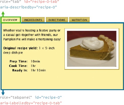
Figure 5.2: Using ARIA properties, we can relate pieces of an interface to one another.
ARIA’s states and properties go a long way toward helping keep the user informed, but few concepts in ARIA are as simple and immediately useful as Live Regions.
IT’S ALIVE!
With the advent of Ajax and the resurgence of JavaScript in general, few things proved to be more of a user experience nightmare than live-updating regions of the page. The usability issues were numerous, but the two big ones were: 1) assistive devices weren’t aware of changes to the page and had no way of directing a user’s attention to them; and 2) users taking advantage of page zoom or browsing on a mobile device are oblivious to content updates occurring off-screen. Thankfully, the ARIA spec includes an attribute that directly addresses this egregious problem: aria-live.
What’s most exciting about aria-live is its simplicity. By applying this single attribute to an element, you can control how and when content updates within it are presented to your users. The aria-live attribute accepts one of three values:
- “off” for when updates are frequent and of little importance to the user, as in the case of a live stream from your Twitter account (doh!);
- “polite” for when updates are only important enough to be announced when the user isn’t doing anything, as in the case of updated news headlines; or
- “assertive” for when updates are important enough to announce immediately, as in the case of form validation messages.
In the Retreats 4 Geeks website, it makes sense to apply aria-live to the contact form:
<article id="contact" aria-live="assertive">
With that in place, users will be kept abreast of any errors encountered when filling in their details and will also be informed when the submission is successful.
SUPPORT AND STUMBLING BLOCKS
Since its introduction, ARIA has gotten a lot of support from the web community. As of this writing, some level of ARIA support is found in every major browser and has been implemented in popular screen reading tools like JAWS, Windows Eyes, NVDA, and Orca. Influential companies like IBM, Sun Microsystems, Adobe, Yahoo!, and Google are all working diligently to increase ARIA’s effectiveness and reach. Even the Javascript community has embraced ARIA, with both Dojo Dijits[5] and jQuery UI[6] integrating ARIA’s roles, states, and properties into their components. Of course, the spec is still developing, so no implementation is complete, but progress is being made.
I’d be remiss if I did not mention the one major issue keeping ARIA from fitting neatly into the progressive enhancement stack, at least when it comes to widget-related roles and states: we have no way of testing for ARIA support in the browser or assistive technology and, therefore, can’t make informed decisions about how to best implement a given widget. Derek Featherstone surfaced this issue in his excellent article for A List Apart Entitled “ARIA and Progressive Enhancement.”[7] I highly recommend reading it to better understand the issue. At the time of this writing, a viable solution has not been proposed, but my fingers are crossed.
KEYSTROKE ISN’T A DIRTY WORD
The last topic I want to touch on before we wrap this, the final chapter of my little book, is keyboard access and controls. With the pervasiveness of the mouse and an increased reliance on touch-based devices like the iPad, it is relatively easy to forget about the humble keyboard, but that would be a critical mistake. The keyboard is an incredibly useful tool and is the standard interface for all non-visual users and most power-users.
When it comes to the keyboard, we’ve learned a great deal in the last few years. First off, we realized that access keys were a good idea in theory, but not so great in practice.[8] Second, we realized that overzealous application of the tabindex attribute could get your users jumping (and not in a good way).[9] But the most important thing we discovered is that we could use JavaScript to “juggle” the tabindex attribute to streamline a user’s path through a complex widget like a tabbed interface or an accordion form.
So what exactly is tabindex juggling? Well, some time in 2005 (it’s hard to pin down the exact origin) it was discovered that assigning a value of “-1” to the tabindex attribute of an element would remove that element from the default tab order of the document.[10] Interestingly, despite being taken out of the document’s tab order, the element remained focusable via JavaScript (element.focus()), which opened up a lot of possibilities for controlling a user’s experience.
Let’s walk through a scenario, revisiting the tabbed interface from earlier:
- A user arrives at the tabbed interface and clicks the tab key on her keyboard, bringing focus to the first tab (which is associated with the visible tab panel).
- Clicking the tab button again moves focus out of the tab interface to the next piece of focusable content instead of taking her to the next tab in the list.
- Holding shift while hitting the tab key brings the user back into the tab list and restores focus to the currently active tab.
- Using the arrow keys, she can move forward and backward through the tabs in the tab list, bringing each associated tab panel into view as she moves.
- Hitting the enter button at any point while navigating through the tab list brings focus to the tab panel associated with that tab.
I know that’s a lot of “tabs” (and a bit of a tall order), but with tabindex juggling and a little JavaScript it becomes quite simple to achieve. Here’s how:
- By assigning a
tabindexof “-1” to every tab and tab panel, you can remove them from the tab order of the page. - Going back and re-assigning a value of “0” to the currently active tab restores their default position in the tab order.
- Using JavaScript you can dynamically adjust the
tabindexproperty of each tab as a user executes keyboard commands like left or right, up or down, allowing the user to move quickly and easily through the interface.
Here’s a snippet from TabInterface’s swap method that shows tabindex juggling in action (along with some ARIA attribute manipulation and class swapping):
function swap( e )
{
  // …
  /* De-activating the current tab & tab panel */
  removeClassName( old_tab, 'active' );
  old_tab.setAttribute( 'aria-selected', 'false' );
  old_tab.setAttribute( 'tabindex', '-1' );
  removeClassName( old_folder, 'visible' );
  old_folder.setAttribute( 'aria-hidden', 'true' );
  /* Activating the new tab & tab panel */
  addClassName( tab, 'active' );
  tab.setAttribute( 'aria-selected', 'true' );
  tab.setAttribute( 'tabindex', '0' );
  addClassName( new_folder, 'visible' );
  new_folder.setAttribute( 'aria-hidden', 'false' );
  // …
}
If you’d like to see this technique in action, you can check out TabInterface.js on Github.[11]
JUST DO IT… ACCESSIBLY
Accessibility is complex and can be difficult to wrap your mind around, but if you tackle it a little at a time, it becomes second nature. And, as with everything else in this book, accessibility is most easily applied in layers, building up the interface bit by bit to create something that meets your users’ needs, whatever they may be.