CHAPTER 3: PROGRESSIVE ENHANCEMENT WITH CSS
“Design is the fundamental soul of a human-made creation that ends up expressing itself in successive outer layers of the product or service.”
With the possible exception of a few straggling websites still limping along with their font elements and spacer GIFs, design on the web is largely accomplished using Cascading Style Sheets (CSS). Sure, there’s Flash, SVG, and canvas, but if you are concerned about the availability and accessibility of your content, you’re going to be using HTML to mark up your content and CSS to style it.
As with HTML, CSS is designed to be fault tolerant. Browsers ignore any syntax they don’t understand[1][2] and, by paying attention to how the language has evolved over time, we can easily embrace progressive enhancement by taking advantage of this ignorance to craft layers of design based on a given browser’s capabilities.
SOMETIMES AN ERROR CAN BE A GOOD THING
This isn’t a CSS book, so I’m not going to walk you through all of the options available to you in CSS. One thing I do want to do, however, is give you an ever-so-brief recap of how CSS works because I think it will provide you with invaluable insight into how to construct progressive designs.
At its most fundamental, CSS is a series of human-readable rule sets, each composed of a selector and declaration block containing a set of property-value pairs (declarations) to be applied to any element matched by the selector.
p {
  color: red;
  font-weight: bold;
}
The example above is about as basic as CSS gets. Anyone who’s worked with CSS before (and probably even someone who hasn’t) can look at it and quickly comprehend that it selects paragraphs and makes their text bold and red. Looking at this example through the lens of fault tolerance, however, you’ll see things a little differently.
When parsing a CSS file to determine how to render a page, a browser reads each rule set and examines it. If it encounters something it doesn’t understand, it experiences something we call a “parsing error.” Parsing errors are often the result of malformed CSS syntax (e.g., the misspelling of a property name or value, a missing colon or semicolon, etc.), but they also result when perfectly valid CSS syntax is beyond the parser’s comprehension.
Assuming all of our curly braces, colons, and semicolons are in their proper places, the example we just saw contains five points at which a parsing error could occur:
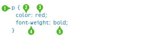
- the selector:
p; - the first property name:
color; - the value of the first property: “red”;
- the second property name:
font-weight; and - the value assigned to the second property: “bold.”
According to the specification, if a browser encounters this rule set and doesn’t understand a part of it (i.e., it experiences a parsing error), the browser must ignore the larger component of the rule set in which the parsing error occurs.
So, for example, if the browser did not understand the CSS color keyword “red,” it would ignore the declaration color: red, but would still apply the remaining declarations. The same goes for the font-weight keyword “bold.” If, however, the browser was unable to understand the selector (p), it would ignore the entire rule set, regardless of the browser’s ability to comprehend the individual declarations it contained.
The reasoning behind this is simple: We don’t know what the future of CSS may be, so it is imperative that a browser ignore declarations and selectors it doesn’t know what to do with. This facilitates advancement of the language (just as it does for HTML) and it also makes it possible to progressively enhance pages using CSS.
For properties, using parsing errors to your advantage is pretty straightforward and it opens up some awesome possibilities. Here’s a quick example using CSS3’s RGBa color scheme:
p {
  background-color: rgb(137, 224, 160);
  background-color: rgba(180, 246, 248, .43);
}
A browser parsing this rule set would likely understand the selector (after all, you can’t get much simpler than an element selector), so it would move on to the first background-color declaration. The background-color property has been a part of CSS since version 1, so the browser should have no problem there and would move on to the assigned value. Similarly, RGB-based color values have also been a part of CSS since the beginning, so the browser will understand that value. With the first declaration passing muster with the parser, the browser would apply background-color: rgb(137, 224, 160); to all paragraphs and the parser would move on to the second declaration.
In the second declaration, background-color is redefined with a new value (per the cascade). Obviously, as we discussed, the browser understands the property, so it would move on to the declared value, which uses RGBa. If the browser understands RGBa, there’s no problem and the RGBa value is assigned to the background-color property, overwriting the original RGB value. If RGBa is not supported, however, the browser experiences a parsing error and ignores the entire declaration, leaving all paragraphs with an RGB value for background-color.
In this example, browsers that comprehend RGBa values would overwrite the background-color value following the rules of the “cascade” (as in Cascading Style Sheets). I’ll go into the cascade a bit more thoroughly later in the chapter, but here’s a quick summary: the cascade dictates that, for equivalent properties, the last one defined is the one rendered.
This is a pretty simple example of how we can use CSS’ fault-tolerant nature to deliver an enhanced experience to more capable browsers. It doesn’t just work at the declaration level either; you can apply this same technique to hide entire rule sets from a particular browser by using a more advanced selector:
html[lang] p {
  /* A bunch of advanced stuff goes here */
}
Any browser encountering this rule set would parse it, starting with the selector. If the browser understands attribute-based selection (in this case targeting any paragraph that is a descendant of an html element that has a language attribute), it will continue parsing the rule set and apply the declarations it understands. If, on the other hand, said browser does not comprehend attribute selectors, it would experience a parsing error and ignore the entire rule set.
Perhaps the most famous example of using this technique to selectively deliver rules to one browser over another (more for effect than practicality) is Egor Kloos’ CSS Zen Garden entry titled “Gemination.”[3]
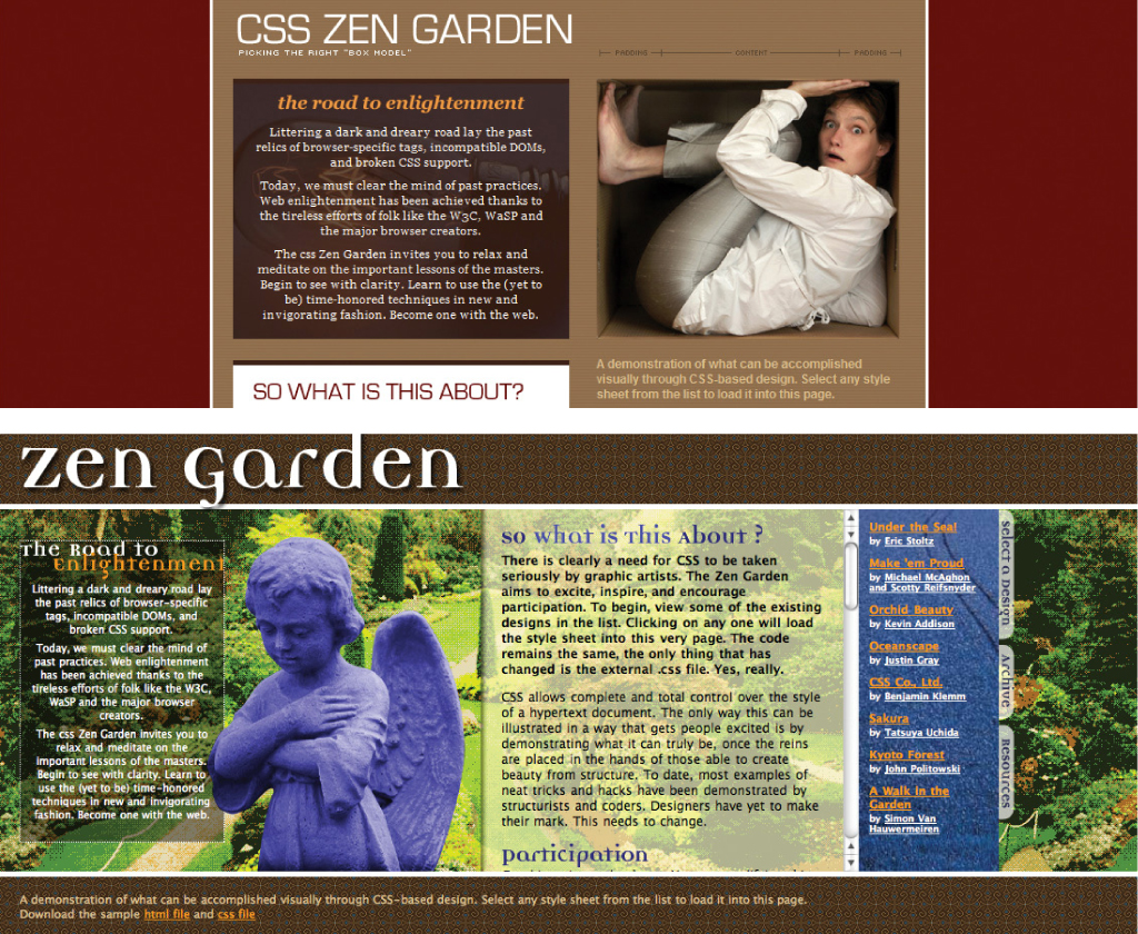
Figure 3.1: Gemination in IE6 (above) and IE7 (below).
In this proof-of-concept piece, Kloos created a basic layout aimed at Internet Explorer (then in version 6) and employed a technique dubbed MOSe (“Mozilla/Opera/Safari enhancement”)[4] to offer more advanced browsers a completely different experience. Kloos used simple selectors for the basic layout and advanced selectors for the enhanced styles. Here’s a snippet that demonstrates his approach:
#intro {
  margin: 0;
  padding: 0;
  width: 660px;
  height: 80px;
  background: transparent url(introkop.gif)
  no-repeat right top;
}

/* … */

body[id=css-zen-garden] #intro {
  position: absolute;
  top: 0;
  left: 0;
  float: none;
  margin: 0;
  width: 100%;
  height: 350px;
  background: none;
}
Following CSS cascade order, the browser parses the first rule set first to render the #intro layout. A little later, the browser parses the “enhanced” rule set for #intro. If the browser understands attribute selectors, it will render a completely different layout for #intro; if it doesn’t, it will ignore the new rule set entirely.
Selector-based screening can be a useful technique, but it tends to trip up many CSS authors who don’t realize selector failure in a compound selector (two or more selector statements, separated by commas) is complete and not discrete:
p,
p:not([title]) {
  color: red;
  font-style: bold;
}
This example has the same five locations for potential parsing errors as the example that opened this chapter, but it also has a sixth one in the second selector (p:not([title])). Browsers that understand only one of these two selectors will ignore the entire rule set rather than just the advanced selector (which, in case you were wondering, looks for paragraphs without title attributes).
Though it may seem unintuitive, the CSS 2.1 spec very clearly states that this is how it should be: “The whole statement should be ignored if there is an error anywhere in the selector, even though the rest of the selector may look reasonable.”[5] Knowing this, we can make better decisions about how and when to combine selectors. As a general rule, it’s best to avoid combining advanced selectors with simple ones (as in the example) unless you want to hide the whole rule set from older browsers.
We’ll come back to this technique momentarily, but first let’s take a quick detour through the world of specificity.
Specificity is another core concept in CSS. It is a measure of how many elements a given selector can select and is the only mechanism available for overruling the cascade (more on that in a second). Some selectors are more specific than other selectors. For example, an id selector (e.g., #intro) is infinitely more specific than a class selector (e.g., .vcard), which is, in turn, infinitely more specific than an element selector (e.g., p).[6]
The specificity of a given selector is calculated by adding the specificity of all of its component parts. Rules applied via very specific selectors will trump those applied with less specific selectors, regardless of their order in the cascade. Looking back at Egor’s attribute selection sleight-of-hand, it’s worth noting that even if the first rule set in the example came second in the CSS file, the browser would still prioritize it lower than the other rule set because its selector has a lower specificity value than that of the second rule set.
Specificity of selectors is something that takes time to master and can cause any number of headaches because if you apply all of your styles with heavy-handed selectors (e.g., each one contains an id selector), you end up having to create even more specific selectors to overrule them (e.g., two id selectors). To avoid an ever-escalating arms race of specificity, I recommend that you avoid making your selectors unnecessarily specific.
Let’s revisit Kloos’ handiwork and apply what we learned regarding parsing errors in compound selectors; in doing so, we can reduce the specificity of Egor’s advanced rule sets and still maintain the spirit of his original work:
#intro {
  /* Old Layout */
}

/* … */

[foo], #intro {
  /* Advanced Layout */
}
In this revision, I changed the second rule set into a compound selector targeting an element with an attribute named “foo” and another element with an id of “intro.” The trick to this approach is that the initial attribute selector is a red herring. The foo attribute is not only non-standard, but it is not used anywhere in the CSS Zen Garden HTML, so the addition of that selector to the rule set does nothing but hide the rule set from browsers that don’t understand attribute selectors. And, most importantly, it leaves the #intro selector unadulterated, keeping its specificity equal to that of the previous rule, allowing the cascade to determine style application.
While this may not always be the technique you immediately reach for when implementing CSS, it’s a good one to remember when you want to use rule set filtering without altering a selector’s specificity. From a maintainability standpoint, this method is not ideal for more than a single rule set here and there; to apply the concept of rule set filtering en masse, there are better options available, and we’ll get to those shortly.
CONCERNS, SEPARATED
The “cascade” is a critically important concept in CSS; in fact it’s the first word in CSS. Literally. Again, it’s beyond the scope of this little book to go through the concept of the cascade in any detail, but there is one facet that can help you become a progressive enhancement expert in no time: order.
Order matters. A lot.
In CSS, when all else is equal (i.e., specificity), the proximity of a style declaration to its target element determines the outcome. We saw this in our earlier example with the two background-color assignments and the same holds true with independent rule sets.
h1 {
  font-size: 2em;
}

h1 {
  font-size: 3em;
}
In this case, h1 elements will be assigned a font-size value of 3em. While it’s unlikely you’ll see the same selector used in two consecutive rule sets like this, it’s not uncommon to see something similar. Take, for example, the images in the “Lodging” article on the Retreats 4 Geeks site:

Figure 3.2: The Lodging article.
The underlying markup for this article is as follows:
<article id="lodging">
<header>
<h1>Where You’ll Stay</h1>
</header>
<figure class="frame focal">
<img class="inner" src="i/lodge.jpg" alt="" title="…"/>
</figure>
<section class="main">
<!-- description of accommodations -->
</section>
<aside class="extra">
<ul class="gallery">
<li>
<figure class="frame">
<img class="inner" src="i/room.jpg" alt="" title="…"/>
</figure>
</li>
<!-- … -->
</ul>
</aside>
</article>
You’ll notice that the article in question uses the same class for each figure element: “frame”; this allows us to achieve consistency with regard to the postcard-with-matte look. I’ve given the focal figure an additional class of, well, “focal.” This setup allows me to use two different CSS rules of equal specificity to apply the appropriate styles to figure.focal. Here’s an example of one such application, followed
by an override:
.frame {
  margin: 0 auto 40px;
}

.focal {
  margin: 0 20px 25px 30px;
}
Each of these rule sets applies to the focal figure in this article (and all others on the page) and both rule sets have selectors of equal specificity. Since the second rule set defines the same property as the first, the margin value of the “focal” figure will be “0 20px 25px 30px” instead of “0 auto 40px.”
Of course, most stylesheets are composed of hundreds of rule sets, making it easy to unintentionally fall victim to issues of proximity. Thankfully, however, we can alleviate some of those issues by taking a layered approach to designing with CSS.
Taking a step back for a moment, you can see the design of a website contains three core facets: Typography, color, and layout. Each brings something more to the table, building the design until it is fully realized. When it comes to progressive enhancement with CSS, we can use that same breakdown to create discrete levels of support that are delivered based on the capabilities of the browser: typography; typography and color; and typography, color, and layout.
As we’ve discussed, rule order matters, so when building a progressive design, we must reconcile our desire to separate the facets of our design with the way the cascade prescribes the interpretation of our rules. In practical terms, that means delivering your groups of facet-specific declarations in a set order: typography, then layout, then color. Why that order? We’ll get to that in a moment.
You can deliver these rule groups as separate stylesheets (either linked or imported) or in a single one.[7] The multiple stylesheet route is pretty straightforward and easy to manage, but it costs you in performance because each stylesheet must be obtained in a separate HTTP request. Beyond that, some browsers don’t cache stylesheets more than one level down (e.g., a stylesheet imported into another stylesheet). For these reasons, the single stylesheet approach makes the most sense to me and is the one I’ve implemented on the Retreats 4 Geeks site.
To illustrate the concept of layering styles, perhaps it’s best to start at the beginning: with no style applied. Figure 3.3 shows the lodging article in Safari with only the default browser styles applied.

Figure 3.3: “Lodging” sans CSS.
As you can see, the content is completely usable with the browser’s default styles. It’s not nearly as attractive as we’d like, but the content is entirely accessible. Applying a layer of general typographic styles, we end up with Figure 3.4.

Figure 3.4: “Lodging” with typographic styles.
The improvement is minor, but it is an improvement. And for browsers that have issues with CSS-based layouts, this may actually serve your users better than trying to force them into a more advanced layout than their browser can handle.
The next layer of style support to offer—and one that’s probably available to users alongside basic typography—is color (which, in some cases, may include background images). Figure 3.5 shows the minor changes color brings to the design of this article.

Figure 3.5: “Lodging,” colorized.
Clearly, we’re looking at incremental improvements here, but improvements nonetheless.
The final layer of style application we’ll concern ourselves with right now is the screen-based layout. Figure 3.2, from earlier in the chapter, shows the “Lodging” article in all of its glory.
You may recall that I mentioned I’ve chosen to define all of these layers in a single file. To accomplish that, I broke the file down into three distinct sections as seen in this excerpt highlighting the styles applied to the images of the “Lodging” article:
/* =Typography */
img {
  display:block;
}

/* =Layout */
@media screen {
  .frame .inner {
    border: 10px solid;
  }
}

/* =Color */
.frame .inner {
  background-color: rgb(227, 222, 215);
  border-color: rgb(227, 222, 215);
}
You were probably quick to notice the @media block that contains layout rules for the screen. The use of @media here is not accidental: it ensures that every medium is given access to the typography and color rules while the layout rules are restricted to user agents that implement the “screen” media type. Following this setup, you can easily do the same for print or any other medium, but more on that in a bit.
The use of @media has another benefit as well: really old browsers (e.g., Netscape 4) don’t understand it. And, following the rules of fault tolerance, browsers ignore anything they don’t understand, so our layout styles remain cleverly hidden from older browsers and devices, leaving them with a purely typographic or, as is more likely, a colorful typographic experience.
Now, getting back to an earlier question, why are the color rules last? Well, my reasoning is simple: I like CSS shorthand. CSS shorthand allows us to combine multiple declarations into a single one. We saw an example of CSS shorthand earlier: border: 10px solid. This declaration is shorthand for:
border-top: 10px solid;
border-right: 10px solid;
border-bottom: 10px solid;
border-left: 10px solid;
Incidentally, each of those declarations is also shorthand. For example, border-top: 10px solid is shorthand for:
border-top-width: 10px;
border-top-style: solid;
border-top-color: inherit;
As you can see, CSS shorthand greatly reduces the complexity of your stylesheets.
Glancing back at the previous example, imagine that the color rule set had been moved before the layout one. The border-color would be set to a light gray. Then, in the layout rules, the border shorthand is used, overwriting the border-color declaration from the earlier rule. It does this because the specificity of the rule sets is identical and the border shorthand always sets the border-color, even if you don’t explicitly define it (“inherit” is the default value, meaning it uses the text color). That’s why I recommend defining color rules last. Shorthand can be really useful for simplifying and compressing your stylesheets, but you need to be aware of the order in which you apply them.
Since we’re on the topic of color, I’ll also mention that in certain cases, you may want to use color in a layout-specific context (e.g., a background color). In those instances, it may make sense to block out a subsection of your rules using @media, just as we did with the overall layout:
/* =Color */
.frame .inner {
  /* colors for every medium */
}

@media screen {
  .frame .inner {
    /* screen-only colors */
  }
}
With our faceted framework in place, it becomes quite simple to introduce additional modules as the need arises. For example, effects:
/* =Color */
a:link, a:visited {
  color: rgb(180, 49, 25);
}

a:hover {
  color: rgb(235, 123, 35);
}
/* … */

/* =Effects */
@media screen {
  a {
    transition-duration: .5s;
  }
}
Now that you have a pretty solid understanding of how to wield CSS’s inherent fault tolerance for the betterment of the browsing experience, let’s delve a little deeper and layer on some additional enhancements.
A LITTLE MISUNDERSTANDING GOES A LONG WAY
As a fault-tolerant language, CSS is a near perfect addition to the progressive enhancement toolbox. In many ways, ignorance is bliss because we can reliably use new features and syntax without having to worry about the browser falling apart when it doesn’t understand something. But what if a browser thinks it understands something, but its understanding is horribly flawed? Yes, of course, I’m speaking of Internet Explorer.
IE9 was released as this book was in production. Based on what I’ve seen so far, it looks like the team has made good on their promise to support standards (including CSS) in a completely interoperable way. IE8 was no slouch in the CSS department, but when you start looking back at IE7 and (shudder) IE6, things take a turn for the worse.
Thankfully, the smart folks at Microsoft gave us a tool that makes it easy to sequester browser-specific patches to CSS, JavaScript, and even markup: Conditional Comments.[8] Conditional Comments are exactly what you’d expect: a specifically-formatted HTML comment that is interpreted by IE but is ignored by all other browsers (because it’s a comment).
Conditional Comments are a boon for the progressive enhancement world because, while progressive enhancement isn’t really about the browser, in practical application, some browsers need a little hand-holding to meet the needs of our users. Conditional Comments give us authors the ability to target a specific version (or versions) of IE. Here’s a quick example of how to put them to use:
<link rel="stylesheet" href="main.css"/>
<!--[if IE 9]><link rel="stylesheet" href="ie9.css"/><![endif]-->
<!--[if lte IE 8]><link rel="stylesheet" href="ie8.css"/><![endif]-->
<!--[if lte IE 7]><link rel="stylesheet" href="ie7.css"/><![endif]-->
<!--[if lte IE 6]><link rel="stylesheet" href="ie6.css"/><![endif]-->
In this particular snippet, you can see that we are including our core CSS file (main.css) on the first line. After that, we have a conditionally-commented stylesheet directed at IE9, using the syntax if IE 9. Skip that one for a moment and focus on the following three lines, the first of which targets IE8 and below (if lte IE 8 {meaning “if less than or equal to IE8”}), the second of which targets IE7 and below (if lte IE 7), and the final line which targets IE6 and below. Used in concert and in this specific order, these three conditionally-commented stylesheets streamline the CSS patching process by allowing the patches you applied to more recent versions of IE to trickle down to earlier versions. The reasoning? Well, if an issue exists in IE7, it’s pretty likely that IE6 had the same problem.
The conditional comment for IE9, by contrast, only targets that specific browser. It could easily be set up in the same “less than or equal to” manner as the subsequent conditional comments, but IE9 is a substantial departure from IE8 on many levels, including its CSS support. Any issues it has are not likely to be issues with those earlier browsers, so there’s no need to make those older browsers read and parse the additional rules. The same setup could have been done for IE8 as well, as the mechanisms that define its CSS support are completely different than those in IE7 and it shares few, if any, issues with IE7 and earlier, but as the design requires that we use some IE-specific filters, it made sense to only have to write them once.
BEYOND THE BASICS
The web is unlike any other medium we’ve encountered thus far. It isn’t print, television, radio, a video game, a kiosk, or an application, but it functions as a hybrid of all of these things and more. Realizing this, the W3C added the ability to target styles to a specific medium. We took advantage of that capability earlier in an @media block, but you’re probably more familiar with using media declarations with linked or embedded stylesheets (using the media attribute) or, possibly, as a suffix to @import statements.
The W3C maintains the list of approved media types, but is open to adding to it as technology evolves. Currently, the list addresses CSS’ application on the computer screen, in print, on televisions, on hand held devices, and in assistant contexts such as screen readers, braille printers, and touch feedback devices. Without a specific media designation, the browser assumes a media type of “screen.”
At their most basic, media assignments use a single media designation, but as with selectors, multiple media assignments can be combined using a comma (which acts as an implicit “or”). In the following example, main.css would be applied for both “print” and “screen” media types:
<link rel="stylesheet" href="main.css" media="screen, print"/>
Media assignments are fault tolerant, though the application of fault tolerance for media assignments is quite different from what is applied to selectors (not that that’s confusing at all): if unknown media types in a comma-separated series are encountered, they are simply ignored and the known media types remain honored.[9]
Unfortunately, in the case of media declarations on @import, IE versions prior to 8 spoil the party even when the media type is one they understand. Yet another reason it’s best to stick with @media, unless you specifically want to hide certain rules from that browser:
@import 'not-for-IE7-or-below.css' screen;
@media screen, print, refrigerator {
  /* IE will get these rules */
}
Media assignments are incredibly powerful because they allow us to create layouts that adapt to the medium in which they are presented. One of the first applications of this technique came from Eric Meyer in 2000, when he showed us how to jettison “printer friendly” pages and use a media-specific stylesheet to provide a printer-friendly view of any web page.[10] Two years later, he built on that concept and showed us how we could use advanced CSS (such as generated content) to progressively enhance that same experience.[11]
Returning to our main stylesheet, we can add support for alternate media within our faceted framework quite easily:
/* =Typography */
/* typography for every medium */
@media screen {
  /* screen-only typography */
}
@media print {
  /* print-only typography */
}

/* =Layout */
/* layout for every medium */
@media screen {
  /* screen-only layout */
}
@media print {
  /* print-only layout */
}

/* =Color */
/* colors for every medium */
@media screen {
  /* screen-only colors */
}
@media print {
  /* print-only colors */
}
Or all of the styles for print could be bundled into a single @media declaration at the bottom:
/* =Typography */
/* typography for every medium */
@media screen {
  /* screen-only typography */
}

/* =Layout */
/* layout for every medium */
@media screen {
  /* screen-only layout */
}

/* =Color */
/* colors for every medium */
@media screen {
  /* screen-only colors */
}

/* =Print */
@media print {
  /* global print-only overrides */
}
In the case of print, it may make the most sense to have a single @media declaration to handle everything, but with other media, it may be advisable to break it up. Each project is different, so you’ll want to play around and see what feels right.
Not your father’s media declarations
A few years after the introduction of independent media support, the W3C upped the ante even more and introduced media queries. Media queries are like media designations on steroids: they provide details about the user’s environment, such as the width of the browser window or even its orientation (as in portrait or landscape). Media queries are incredibly powerful and allow you to really fine-tune your designs for specific devices. As such, they are quickly becoming an indispensable tool in progressive enhancement.
Using media queries (which can go wherever you’d place a standard media designation), you can add a set of rules to a page based on the capabilities of the user agent. Let’s take a look at an example:
@media (min-width:1025px) {
  /* … */
}
In this case, we designated a group of rule sets to be used only if the browser width is 1025px or more.
The CSS3 module that defines media queries reached the Candidate Recommendation stage in the middle of 2009 and prescribes how to obtain browser dimensions as well as numerous other aspects of the device it is running on, such as its dimensions, orientation, color capabilities, resolution, and the like. Not all of the properties are currently supported, but enough are to make them worth considering.
Media queries build upon the standard media designation syntax by introducing the “and” combinator and negation using the “not” keyword. These additions give you a bit more flexibility to target the screen medium where the browser is over 1024px wide (screen and (min-width:1025px)), or anything besides print (not print), but they do not add an explicit “or,” so you can’t perform more complicated queries like you can in an actual programming language (e.g., A and B or B and C, but not A and C). You can, however, imply “or” using a comma.
Here’s a rather exhaustive compound media query with an explanation of what it does in the comment:
@media screen and (min-device-width:1024px) and (max-width:989px),
       screen and (max-device-width:480px),
       screen and (max-device-width:480px) and (orientation:landscape),
       screen and (min-device-width:481px) and (orientation:portrait) {
  /* Layout for narrower desktop browser window
   (below 990px) or
   iPhone running iOS 3 (or equivalent) or
   iPhone running iOS 4 (or equivalent) in “landscape” view or
   iPad (or equivalent) in “portrait” view */
}
Revisiting our example stylesheet, I have used media queries to progressively enhance the page by making a baseline layout aimed at older browsers and tablets. I then adjust the layout for wider desktop browsers and narrower smartphones:
/* =Basic Layout */
@media screen {
  /* … */
}

/* =Full Layout */
@media screen and (min-width:1025px) {
  /* … */
}

/* =Narrow Layout */
@media screen and (max-width:765px) {
  /* … */
}
Figure 3.6 shows the alternate layouts available. In some instances the changes from version to version are pretty drastic (e.g., each has a different navigation treatment) while others are more subtle (e.g., the postcard-based contact form adjusts to accommodate a narrower screen). Without getting caught up in the specific differences between these layouts, the important thing to recognize is that media queries can be used to create truly adaptive layouts using only CSS. For more information on adaptive layouts, consult the “Further Reading” section of Chapter 6.
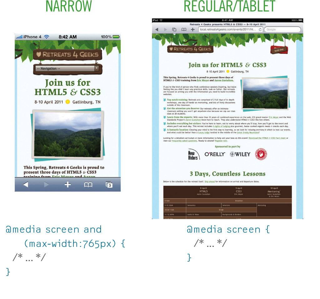
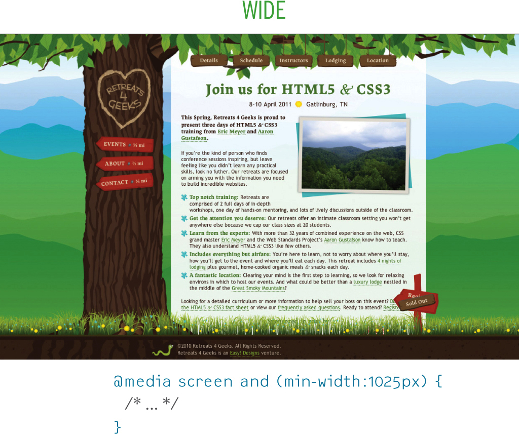
Figure 3.6: Alternate layouts with media queries.
RICH IN LAYERS
As you can see, there are numerous ways we can use CSS to progressively enhance our web pages. Some techniques, such as taking advantage of parsing errors, are so simple and commonplace that you’re probably using them right now. Others, such as faceted style separation, may provide a slightly different take on your current practices or may be completely foreign to you. When used in combination, however, these techniques weave together, layer upon layer, to provide a tailored experience for every user, no matter what her browser or device supports.