CHAPTER 2: PROGRESSIVE ENHANCEMENT WITH MARKUP
“The meaning is in the content of the text and not in the typeface.”
When it comes to the web, markup calls the shots. It is the foundation upon which every beautiful design and each amazing experience is built. Whether your preferred flavor is HTML or its more rigorous sibling, XHTML, each element has a purpose and can profoundly affect the user experience for better or worse, depending on how you use (or abuse) it.
FROM A ROUGH START TO THE RIGHT WAY™
When we first began building web pages, many of us misunderstood the importance of good markup. Those of us coming to the web from a programming background often considered learning HTML beneath us, so we never put in the time to come to grips with the semantics it provided. Those of us who came to the web from a design background didn’t understand the importance of semantics either. We thought only of the presentational aspect of a web page and latched on to the table as a means of laying out pages on a grid, then we went hog-wild and found hundreds of other uses for the table element, many of which supplanted existing (and well-supported) semantic elements (like lists).
In many offices across the globe, advocacy for semantic application of HTML fell on deaf ears; the argument was seen as a largely idealistic one because: 1) the fact remained that old-school websites looked okay in modern browsers and 2) the case for greater web accessibility was lost on many people who had no first-hand experience of using the web with a disability. Then Google came along and changed everything. Suddenly, semantic markup was important.
Google was the first search engine to take semantics into account when indexing web pages. Starting with the humble anchor (a) element, the cornerstone of their original PageRank algorithm, Google pioneered the use of semantic markup to infer meaning and relevancy. The other search engines soon followed and, as search engine spiders began hunting for other meaningful HTML elements on web pages (e.g., h1 which indicates the most important content on a page), semantic markup became more important to the business world because proper use of it meant a better ranking in search engines and, thereby, a greater opportunity to attract new customers.
THE SEMANTIC FOUNDATION
If content were soil, semantic markup would be the compost you’d add to ensure a productive garden. It enriches the content, providing your users with clues about intent and context, as well as supplementary information about the content itself.
Take, for example, the abbreviation element (abbr). It is used to denote abbreviations (and acronyms, now that it has officially replaced the acronym element):
Gatlinburg, <abbr title="Tennessee">TN</abbr>
In this simple HTML snippet, you can see how the abbreviation enhances the letters “TN” by informing the user that they stand for “Tennessee.”
As HTML has evolved, its vocabulary has steadily expanded to offer more options for describing the content it encapsulates. The advent of HTML5 ushered in a slew of new semantic options (such as header) and even augmented a few existing ones (such as the aforementioned abbr that took over for the ousted acronym). As we proceed through this chapter, we’ll employ several of these new/revised elements and I will provide a little background about why they are an appropriate choice for marking up content.
Let’s get started.
SAYING WHAT WE MEAN
Looking at the Retreats 4 Geeks web page[1], it may be hard to figure out where to start, but we’ll begin with the most important content: the name of the site and the links to the various sections of the page (since this is, for our purposes, a single-page website).

Figure 2.1: A screen shot of the site highlighting the site name and navigation elements.
Let’s consider this component from a semantician’s point of view, starting with the logo. The Retreats 4 Geeks logo is an image, so we should use an img element to mark it up.[2] It’s also pretty important because it provides a context for the entire page, so it should be wrapped in an h1, an element reserved for the most important content on a page:
<h1><img src="i/logo.png"/></h1>
Though the example page is written using HTML5, I’ve always been more comfortable with the XML serialization of the language, so I’ve chosen to stick with that syntax (as evidenced by the trailing slash on the img element). It is more a matter of preference than requirement.
Moving on to the navigation, we’re presenting a list of links, so it should be marked up as such. As the order of the links corresponds to the order of the sections on the page, the list should probably be of the ordered variety (ol). Each link gets placed in a list item (li) and wrapped in an anchor element (a):
<ol>
  <li><a href="#details">Details</a></li>
  <li><a href="#schedule">Schedule</a></li>
  <li><a href="#instructors">Instructors</a></li>
  <li><a href="#lodging">Lodging</a></li>
  <li><a href="#location">Location</a></li>
</ol>
Up until this point, we’ve made the obvious choices with regard to markup, employing semantics we’ve had in HTML since the beginning. Just over a year ago, we would have likely stopped here and considered the header complete, but HTML5 gives us the opportunity to improve both the semantic value and the accessibility of this content.
Traditionally, we might have employed a page division (div) with a semantic identifier (id) of “header” to contain these two elements. Divisions, as you’ll recall, are used to group content, but they provide no context as to the purpose or function of that group (which is why we would identify it as the “header”). HTML5, however, introduces an element that provides the explicit semantic meaning for that division: header.
Semantically, a header is used to demarcate any content that is summarily important to a page or section of a page. It can be used to encapsulate headings or heading groups (contained in the new hgroup element), relevant navigational aids, and introductory content. As such, it makes a perfect container for the title of our page and the list of anchors to each article within the page.
HTML5 also grants us another more appropriate option when it comes to the navigation. Whereas we would have traditionally identified the ordered list as “nav” or “main-nav,” HTML5’s nav element more directly expresses the semantics we’re trying to imbue the ol with by providing that semantic id. The nav element can be used to wrap any group of navigational links and functions as the semantic equivalent of the ARIA landmark role of “navigation” (which we’ll discuss more in Chapter 5).
With these additions, the markup for this section is now:
<header>
  <h1><img src="i/logo.png"/></h1>
  <nav>
    <ol>
      <li><a href="#details">Details</a></li>
      <li><a href="#schedule">Schedule</a></li>
      <li><a href="#instructors">Instructors</a></li>
      <li><a href="#lodging">Lodging</a></li>
      <li><a href="#location">Location</a></li>
    </ol>
  </nav>
</header>
And, thanks to the fact that they ignore anything they don’t understand, the markup we’ve used will work in every browser, regardless of age. Sure, modern browsers may treat the newer elements differently, but even text-based browsers (such as Lynx) will be able to access the content. Devoid of style and stripped of JavaScript-based interactivity, the markup just works, providing us with the second level of support in the progressive enhancement continuum. (Remember: the content itself forms the crucial first level).
INVISIBLE AND ADVISORY
As good as this markup is, we’ve neglected a major accessibility requirement by not providing any alternate text for our logo image (expressed using the alt attribute). “Alt text,” as it’s most often known,[3] provides a text-based back-up for users who have images turned off; it is also the content that is read to users of screen reading software (such as the blind), which is why its inclusion is critical.
Returning to the example, I’ve added a simple alt attribute:
<h1><img src="i/logo.png" alt="Retreats 4 Geeks"/></h1>
When the image in question is a logo or conveys information needed to understand the page or accomplish key tasks, alt text should always be supplied. For all other images, it’s perfectly legitimate to leave the alt text blank (alt=""). I would even go so far as to say it’s advisable to use an empty alt attribute in any instance where the image doesn’t supply necessary information. I say this for two reasons: 1) no one really wants to read vacuous copy like “Smiling man throws a Frisbee to a leaping Golden Retriever” any more than someone else wants to write it; and 2) screen readers will speak the contents of the alt attribute aloud, but will skip any images with empty alt attributes.[4]
Whereas the alt attribute is used to provide alternative content, the title attribute is used to provide advisory information about an element. In the case of the navigation links in the above example, we can use title to provide the user with information about where each link will take her:
<li><a href="#location" title="Get the 411 on Gatlinburg, Tennessee">Location</a></li>
Similarly, further down the page in the “location” section, title provides context to the link that wraps the map:
<a href="http://maps.google.com/…" title="View Gatlinburg, Tennessee on Google Maps">
  <img src="http://maps.google.com/…" alt="A map showing the location of Gatlinburg, Tennessee"/>
</a>
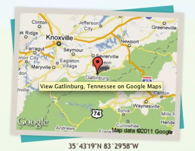
Figure 2.2: A screen shot of the location portion of the page with a cursor over the map.
AD-HOC SEMANTICS
HTML is filled with attributes that help enrich the elements they adorn. It prescribes a number of “fixed use” ones, like alt and title, but it also offers a handful of attributes that can be used to build upon the language’s native semantics in a less formal way. I’m talking, of course, about id and class.
When Dave Raggett drafted a specification for HTML 3.0,[5] it contained two new concepts: classification and identification, expressed via the class and id attributes respectively.[6] These two attributes were not formally introduced into the HTML lexicon until HTML 4.0, but were implemented in browsers around the same time as Cascading Style Sheet (CSS) support was added. And CSS, of course, brought us two simple selectors that targeted these attributes explicitly, causing some unfortunate confusion over the intended use of class and id from the get-go.
For years, nearly every web developer working with CSS thought the correlation between the attributes and the selectors was intentional, believing that id and class were intended purely for use with style sheets. You can hardly blame us though, CSS Level 1 did not provide many mechanisms for selecting elements, so it made sense that the class selector (e.g., ul.menu) and the id selector (e.g., div#content) would have been introduced (along with their corresponding attributes) for the purposes of both the general and specific application of style, respectively.[7]
Thankfully, we now understand how the class and id attributes were meant to operate. The class attribute was introduced specifically to address the limited set of elements within the HTML lexicon:
As time goes by, people’s expectations change, and more will be demanded of HTML. One manifestation of this is the pressure to add yet more tags. HTML 3.0 introduces a means for subclassing elements in an open-ended way. This can be used to distinguish the role of a paragraph element as being a couplet in a stansa [sic], or a mathematical term as being a tensor. This ability to make fresh distinctions can be exploited to impart distinct rendering styles or to support richer search mechanisms, without further complicating the HTML document format itself.[8]
The intent was that this attribute would contain a list of subclasses for the particular element they were applied to, with the classes listed from most general to most specific:[9]
<a href="…" title="…">
  <img class="illustration map" src="…" alt="…"/>
</a>
The spec introduced the id attribute for the purposes of identifying a specific element on the page (this is why each id on a page needs to be unique). In practice, this identifier would be used as a reference point for style rules (#details { … }), scripts (document.getElementById('details')), and anchors (<a href="#details">). You may recall that we actually used that last mechanism in the navigation introduced earlier in the chapter.
As all of the information for the Retreats 4 Geeks event is included on a single page, I’ve grouped each chunk of content into separate article elements[10], each with a unique id. The article element was introduced as part of HTML5 and demarcates content that forms an independent part of the document, such as a newspaper article, blog post, or, in our case, a distinct topic. Each of the articles on the page is then targeted, using its id as an anchor reference, by the navigation links. Clicking one of these links will jump a user directly to the appropriate content:
<body>
  <header>
    <h1><img src="i/logo.png" alt="Retreats 4 Geeks"/></h1>
    <nav>
      <ol>
        <li><a href="#details" title="Find out what this retreat is all about">Details</a></li>
        <li><a href="#schedule" title="Get familiar with what this retreat will cover">Schedule</a></li>
        <-- … -->
      </ol>
    </nav>
  </header>
  <div id="content">
    <article id="details">
      <-- … -->
    </article>
    <article id="schedule">
      <-- … -->
    </article>
    <-- … -->
  </div>
</body>
The class and id attributes allow page authors to create their own semantics on top of those that are part of the spec. Together, these ad-hoc semantics imbue the markup with greater meaning and, over time, have gravitated toward a common set of classifications and identifiers in use across the globe (e.g., div#header and ul#nav). This common set of classifications and identifiers has, in turn, provided valuable feedback in the development of the HTML language itself (resulting in additions like HTML5’s header and nav elements, which we reviewed earlier) and fostered the development of a community-driven set of extensions to HTML known as “microformats.”
CODIFIED CONVENTIONS
Microformats are a set of community-driven specifications for how to mark up content to expose semantics (and meta data) that are not available in HTML (or XHTML). At their essence, microformats formalize organically-developed coding conventions into a specification that addresses an oversight or limitation in HTML. For example, HTML provides no robust way to mark up contact information or events, so the community created microformats to fill those needs.
The first microformat arose from a desire to express associations between individuals on the web and was called the XHTML Friends Network (“XFN” for short). Though not developed as a “microformat” (that term came later), XFN was a perfect example of extending the semantics of HTML with a specific goal in mind.
Developed by Tantek Çelik, Matthew Mullenweg, and Eric Meyer, XFN makes use of the oft-neglected rel attribute. The purpose of rel—which you are probably familiar with in the context of the link element for inclusion of an external stylesheet (rel="stylesheet")—is to indicate the relationship of the target of an anchor to the current page. The idea was simple: if I wanted to point from my blog to the blog of a colleague, I could employ XFN and add rel="colleague" to the link. Similarly, if I was linking to my wife’s blog, I would use rel="friend co-resident spouse muse sweetheart co-worker" because she is all of those things.[11]
On its own, this additional markup does little more than provide a bit more information about our relationship and why I might be linking to another website, but if I use it for every link in my blog roll and those people, in turn, use it in theirs, all of a sudden we’ve created a network that is navigable programmatically, creating myriad opportunities for data mining and repurposing. And that’s exactly what happened: XFN spread like wildfire. Software developers integrated it into popular blogging tools (e.g., WordPress, Movable Type) and developers at nearly every site on the “social web” (e.g., Twitter , Flickr, Last.fm) began adorning user profile pages with the special case of rel="me" (used to link from one web page you control to another), enabling tools like Google’s Social Graph to quickly build a full profile of their users starting from a single URL.[12]
An example of XFN in the Retreats 4 Geeks page can be found in the footer[13]:
<footer> <p id="copyright">©2010 Retreats 4 Geeks. All Rights Reserved.</p> <p>Retreats 4 Geeks is an <a rel="me" href="http://easy-designs.net/">Easy! Designs</a> venture.</p> </footer>
From that simple (yet powerful) beginning, microformats have increased in number to address common and diverse needs from marking up a person’s profile (hCard), event listings (hCalendar), content for syndication (hAtom), and resumes (hResume), to indicating license information (rel-license), controlling search engine spidering (rel-nofollow), and facilitating tagging (rel-tag).[14]
Almost in parallel with the development of these microformats, numerous tools sprung up to make use of them. As you can probably guess from my mention of the Google Social Graph, search engines have started to pay attention to microformats and, in some cases, even rank microformatted content higher than non-microformatted content. Browser add-ons-such as Operator[15] and Oomph[16] enable users to extract and repurpose microformatted content. Microformat parsers are also available for nearly every programming language and there are even web-based services, such as Optimus[17] and H2VX[18], that give users more direct access to the microformats in use on their sites.
As you can see, microformats are yet another layer in the progressive enhancement continuum, enabling us to make our sites even more useful to our users. After all, how cool is it that, using a tool like Operator or a service like Optimus, we can enable users to import an event to their calendar or a business card to their address book directly from our web page? I think that’s pretty awesome.
Call me, call me anytime
As our demo website is for an event, the hCalendar microformat is an obvious place to start, but let’s hold off on that for a moment and look at how we can apply the hCard microformat to my bio section in the “Instructors” article. Before we take a look at the markup though, let’s go over the key hCard classifications.
| CLASS | PURPOSE |
|---|---|
| vcard | Signifies that hCard is being used. (This should be the class of the root element containing the hCard information.) |
| fn | Short for “formatted name,” it’s used to wrap the name of the person who owns the hCard |
| url | Indicates that a given link takes the user to a web page about this person |
| photo | Denotes a photo of this person |
| org | Identifies the company or organization of which this person is a part |
| role | Conveys the role this person holds within the organization |
Table 2.1: Key hCard classifications
The hCard microformat offers many other options for marking up a person’s profile, but these are the key ones we’re going to concern ourselves within the context of the Retreats 4 Geeks website. And, of these five classes, only “vcard” and “fn” are actually required.
Now let’s take a look at the content we’ve got to work with:
<section id="aaron-gustafson">
  <figure>
    <img src="i/aaron-gustafson.jpg" alt=""/>
  </figure>
  <h1>Aaron Gustafson</h1>
  <p>Aaron has been working on the web for nearly 15 years and, in that time, has cultivated a love of web standards and an in-depth knowledge of website strategy and architecture, interface design, and numerous languages (including XHTML, CSS, JavaScript, and PHP). Aaron and his wife, Kelly, own <a href="http://easy-designs.net">Easy! Designs</a>, a boutique web consultancy based in Chattanooga, TN. When not neck deep in code, Aaron is usually found evangelizing his findings and sharing his knowledge and passion with others in the field.</p>
  <p>Aaron has trained professionals at <cite>The New York Times</cite>, Gartner, and the US Environmental Protection Agency (among others), and has presented at the world’s foremost web conferences, such as An Event Apart and Web Directions. He is Group Manager of the <a href="http://webstandards.org">Web Standards Project (WaSP)</a> and serves as an Invited Expert to the World Wide Web Consortium’s <a href="http://www.w3.org/2005/Incubator/owea/">Open Web Education Alliance (OWEA)</a>. He created <a href="http://ecsstender.org">eCSStender</a>, serves as Technical Editor for <a href="http://alistapart.com"><cite>A List Apart</cite></a>, is a contributing writer for <a href="http://netmag.co.uk"><cite>.net  Magazine</cite></a>, and has filled a small library with his technical writing and editing credits. His next book, <cite>Adaptive Web Design: Crafting Rich Experiences with Progressive Enhancement</cite>, is due out in early 2011.</p>
</section>
You probably noticed that the section has an h1 as its title. Don’t worry: in HTML5, each section creates a new context within which it’s okay to restart the headings at h1. It takes a little getting used to at first, I know, but it makes sense and addresses the limited number of heading levels quite well.[19]
If you’ve got keen eyes, you’ve likely already identified exactly where each of the hCard classes should be applied, but I’ll step through each one, just to be sure, starting with the easiest one: “vcard.” This classification needs to be applied to the containing element, in this case, the section:
<section id="aaron-gustafson" class="vcard">
The next obvious one is “fn,” which should wrap my name. As my name is already wrapped in an h1, we can apply a class of “fn” to that element to indicate the text contained within the element is my name.
<h1 class="fn">Aaron Gustafson</h1>
Next, we can add a class of “url” to the “Easy! Designs” link, denoting that it points to a website I control:
… <a class="url" href="http://easy-designs.net">Easy! Designs</a>, …
Continuing down the list, we can apply “photo” to the image of me, which is contained in a figure element. HTML5 introduced the figure element to contain a discrete chunk of content—usually an image or graphic with an optional caption (figcaption)—that can stand on its own or be removed from a document without altering its meaning:
<figure>
  <img class="photo" src="i/aaron-gustafson.jpg" alt=""/>
</figure>
We need to add the two final classes, “org” and “role” to this markup in the final paragraph of my bio, but the content presents us with a bit of a conundrum as there are several roles and organizations mentioned. Which one should we use? Is it okay to include multiple organizations and roles?
There is nothing in the hCard spec that restricts an hCard to a singular organization and role, but, in practice, few microformats parsers will expose anything beyond the first one encountered because address book software doesn’t typically allow for multiple organizations and roles. For that reason, we’ll simply add the classification to my primary function: Group Manager of the Web Standards Project.
The “org” bit is easy because “Web Standards Project” is already contained in an element. My role there, however, is part of a larger text string and is not contained within its own element. To apply the classification to my role only, we have to make use of an element bereft of semantic meaning, such as b:[20]
… He is <b class="role">Group Manager</b> of the <a class="org" href="http://webstandards.org">Web Standards Project (WaSP)</a> …
Viewed all at once, you can see that the adjustments to incorporate the hCard microformat are quite minimal:
<section id="aaron-gustafson" class="vcard">
  <figure>
    <img class="photo" src="i/aaron-gustafson.jpg" alt=""/>
  </figure>
  <h1 class="fn">Aaron Gustafson</h1>
  <p>Aaron has been working on the web for nearly 15 years and, in that time, has cultivated a love of web standards and an in-depth knowledge of website strategy and architecture, interface design, and numerous languages (including XHTML, CSS, JavaScript, and PHP). Aaron and his wife, Kelly, own <a class="url" href="http://easy-designs.net">Easy! Designs</a>, a boutique web consultancy based in Chattanooga, TN. When not neck deep in code, Aaron is usually found evangelizing his findings and sharing his knowledge and passion with others in the field.</p>
  <p>Aaron has trained professionals at <cite>The New York Times</cite>, Gartner, and the US Environmental Protection Agency (among others), and has presented at the world’s foremost web conferences, such as An Event Apart and Web Directions. He is <b class="role">Group Manager</b> of the <a class="org" href="http://webstandards.org">Web Standards Project (WaSP)</a> and serves as an Invited Expert to the World Wide Web Consortium’s <a href="http://www.w3.org/2005/Incubator/owea/">Open Web Education Alliance (OWEA)</a>. He created <a href="http://ecsstender.org">eCSStender</a>, serves as Technical Editor for <a href="http://alistapart.com"><cite>A List Apart</cite></a>, is a contributing writer for <a href="http://netmag.co.uk"><cite>.net Magazine</cite></a>, and has filled a small library with his technical writing and editing credits. His next book, <cite>Adaptive Web Design: Crafting Rich Experiences with Progressive Enhancement</cite>, is due out in early 2011.</p>
</section>
But these simple changes allow a microformats parser to put together a profile of me quite easily.
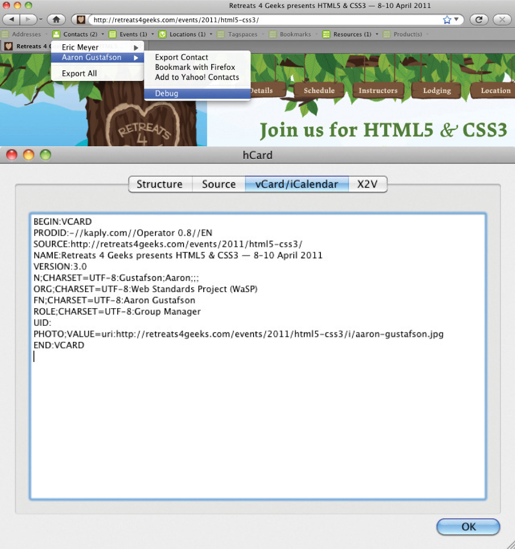
Figure 2.3: Screen shots of the information exposed from this code via Operator.
What’s really interesting about microformats is that you can use them however you like. The class names don’t need to appear in any particular order (so long as they appear within an appropriately-classified parent element) and they don’t require that the content match the intended export format in any way. And, as this example demonstrates, the hCard does not need to be marked up like a rolodex card entry; instead, you are free to sprinkle its component parts throughout your prose using the appropriate class names to indicate each one.
Mark your calendars
With hCard covered, we can take a look at the hCalendar event microformat mentioned earlier. Again, before we look at the markup, let’s take a look at some of the more important hCalendar classifications.
| CLASS | PURPOSE |
|---|---|
| vevent | Signifies that an hCalendar event is being used. (This should be the class of the root element containing the hCalendar event information.) |
| dtstart | Indicates the start date of the event |
| dtend | Denotes the end date of the event |
| summary | Identifies the name of the event |
| location | States the location of the event |
| description | Provides additional details about the event |
Table 2.2: Important hCalender classifications
As the entire demo page is dedicated to the event, the class-application process needs to begin further up the DOM tree. I’ve decided to start at the content container (div#content), to which I’ve assigned the root “vevent” class. While in the following example, the hCalendar content is contained within article#details, applying the class to an ancestor element in this manner gives us the flexibility to include more hCalendar properties in the other articles as well:
<div id="content" class="vevent">
As I mentioned, the first article (article#details) contains the bulk of the information about the event. Let’s take a look at that markup before we review the application of the hCalendar classes:
<article id="details">
<header>
<h1>Join us for HTML5 & CSS3</h1>
<p>8–10 April 2011</p>
<p>Gatlinburg, <abbr title="Tennessee">TN</abbr></p>
</header>
<figure>
<img src="i/mountains.jpg" alt=""/>
</figure>
<section class="main">
<!-- event overview -->
</section>
</article>
<!-- / #details -->
Glancing over the markup, you’ve probably already figured out where most of the hCalendar classifications should be applied. Right off the bat, you have the name of the event or “summary” in hCalendar parlance:
<h1>Join us for <b class="summary">HTML5 & CSS3</b></h1>
In terms of source order, the next piece we encounter is the date range “8–10 April 2011.” Traditionally, we would have used abbreviation elements (abbr) to mark up this data, but HTML5 introduces a new element explicitly tasked with indicating temporal information: the time element. One problem: to supply a start and end date for the event, we need to break the content up into two dates before wrapping each in a time element.
Though it may seem odd at first, what makes the most sense is wrapping the “8” in one time element and “10 April 2011” in the other. We do that because the “8” is really implying “8 April 2011,” albeit in an abbreviated form (which is why abbr made a lot of sense previously). The time element allows for further clarification of dates using the datetime attribute, which is how I’ve expressed the full starting date:
<p><time datetime="2011-04-08">8</time>–<time datetime="2011-04-10">10 April 2011</time></p>
hCalendars only require a summary and a starting date, so we only need to apply the “dtstart” classification to the first time element for the microformat to be valid. But since we have an end date, it makes sense to apply that one too:[21]
<p><time class="dtstart" datetime="2011-04-08">8</time>–<time class="dtend" datetime="2011-04-10">10 April 2011</time></p>
Continuing down the article, “location” is pretty obvious: Gatlinburg, TN:
<p class="location">Gatlinburg, <abbr title="Tennessee">TN</abbr></p>
The final piece of our hCalendar puzzle is the “description” and the most obvious choice of content for that property is the “main” section of the article:
<section class="main description">
  <!-- event overview -->
</section>
And that’s it. With the microformatted content in place, it’s now quite simple for users to export the event directly to their calendar.
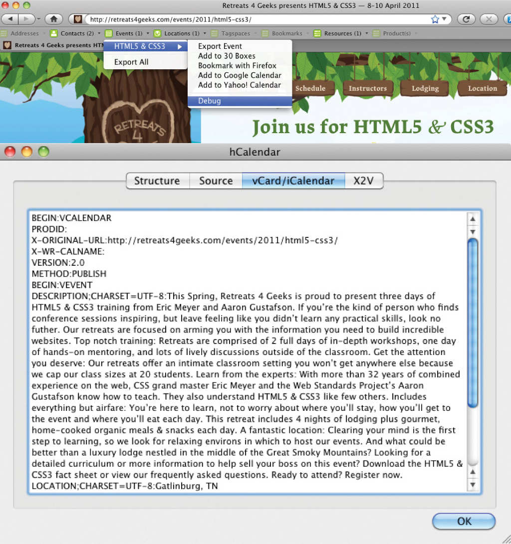
Figure 2.4: Screen shots of the information exposed from this code via Operator.
Again, we’ve seen how microformats can directly enhance the meaning of already meaningful markup in order to improve the user experience. Picture perfect progressive enhancement!
IT’S THE FOUNDATION
While progressive enhancement is often discussed in terms of CSS and JavaScript, it applies equally to the markup. As we’ve seen in this chapter, every time we choose a meaningful element, we make it easier for the page to do its job by enhancing accessibility and increasing its visibility to potential users through organic search. We’ve also seen how both classification and identification can feed back into HTML, helping it become an even more expressive language. And, as is the case with microformats, we’ve even seen how the names we choose have the capacity to enhance both the semantics and usability of the content to which they are applied.
Semantic markup is an invaluable step in the progressive enhancement continuum; in concert with well written content, it forms the foundation upon which the entire user experience is built.