CHAPTER 1: THINK OF THE USER, NOT THE BROWSER
If you’ve been working on the web for any amount of time, you’ve likely heard (or even used) the term “progressive enhancement” before. As you probably know, it is the gold standard of how to approach web design. But what is progressive enhancement really? What does it mean? How does it work? And how does it fit into our workflow in a time of rapidly evolving languages and browsers?
These are all good questions and are the very ones I answer throughout this book. As you’ll soon see, progressive enhancement isn’t about browsers and it’s not about which version of HTML or CSS you can use. Progressive enhancement is a philosophy aimed at crafting experiences that serve your users by giving them access to content without technological restrictions.
Cue the kumbayahs, right? It sounds pretty amazing, but it also sounds like a lot of work. Actually, it’s not. Once you understand how progressive enhancement works, or more importantly why it works, you’ll see it’s quite simple.
As we progress through this book you’ll see numerous practical ways we can use progressive enhancement in conjunction with HTML, CSS, and JavaScript to create adaptive websites that will not only serve your users well, but provide them with a fantastic experience, no matter what browser or device they are using to access it.
But before we get down to the brass tacks of application, we need to discuss the hows and whys of progressive enhancement, the underpinnings of the philosophy.
ADAPT OR DIE
And when it comes right down to it, progressive enhancement relies on one principle: fault tolerance.
Fault tolerance is a system’s ability to continue to operate when it encounters an unexpected error. This property makes it possible for a lizard to regrow its tail and for a brain to reroute neural connections after a trauma. Nature has proven herself quite adept at fault tolerance and, following her example, we’ve incorporated that concept into our own creations. For example, the oft-lauded “smart grid” can automatically avoid or mitigate power outages by sensing (and in some cases anticipating) system problems.
If you use the web, whether as your professional canvas or simply as a casual consumer, you benefit from fault tolerance all the time. Not only is it baked into the protocols that route a request from your web browser to the server you’re trying to reach, it is sewn into the very fabric of the languages that have made the web what it is today: HTML and CSS. As prescribed by the specifications for these two languages, browsers must ignore anything they don’t understand. That simple requirement makes progressive enhancement possible. But more on that in a minute.
Another interesting aspect of fault tolerance is how it allows for evolution. Again, looking to nature, you can see this in areas where climate or other environmental factors have caused enough of a change that organisms are forced to adapt, move, or die.
In 1977, the Galapagos Islands experienced a drought that drastically reduced the availability of the small seeds that supported the islands’ finch population. Eighty-five percent of the islands’ finches were wiped out due to starvation. Oddly enough, it was the larger birds that survived. Why? Because they possessed large beaks capable of cracking the larger, harder seeds that were available. In the absence of a drought, the larger finches possessed no distinct advantage over their smaller relatives, but when the environment changed, they were perfectly positioned to take advantage of the situation and not only survived the drought, but passed their genes along to the next generation of finches which, as you’d expect, tended to be larger.
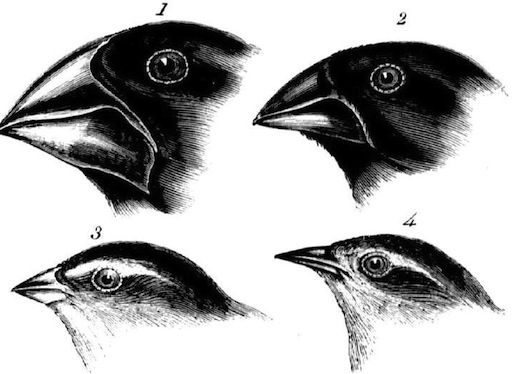
Public Domain
Figure 1.1: The varied beaks of Galapagos finches (a.k.a. Darwin’s Finches, Geospiza fortis) as seen in The Zoology of the Voyage of H.M.S. Beagle, by John Gould.
HTML and CSS have a lot in common with the Galapagos finches. Both were designed to be “forward compatible,” meaning everything we write today will work tomorrow and next year and in ten years. They are, in a sense, the perfect finch: designed to thrive no matter how the browsing environment itself changes.
These languages were designed to evolve over time, so web browsers were instructed to play by the rules of fault tolerance and ignore anything they didn’t understand. This gives these languages room to grow and adapt without ever reaching a point where the content they ensconce and style would no longer be readable or run the risk of causing a browser to crash. Fault tolerance makes it possible to browse an HTML5-driven website in Lynx and allows us to experiment with CSS3 features without worrying about breaking Internet Explorer 6.
Understanding fault tolerance is the key to understanding progressive enhancement. Fault tolerance is the reason progressive enhancement works and makes it possible to ensure all content delivered on the web is accessible and available to everyone.
As fault tolerance has been a component of HTML and CSS since the beginning, you’d think we (as web professionals) would have recognized their importance and value when building our websites. Unfortunately, that wasn’t always the case.
“GRACEFUL” MISSTEPS
For nearly a decade after the creation of the web, the medium evolved rapidly. First, the National Center for Supercomputing Applications at the University of Illinois—NCSA for short—gave us Mosaic, the first graphical browser, and HTML got the img element. Then came audio. Then video. Then interaction. It was a challenge just to keep up with the rapidly-evolving technology and in our rush to keep up, we lost sight of fault tolerance and began building according to the latest fashion. Some of our sites consisted entirely of full-page image maps layered atop elegantly designed JPEGs. Others became shrines to Macromedia’s Flash and Director. Few were usable and even fewer were accessible.
This era gave rise to the development philosophy known as “graceful degradation.”
Graceful degradation was the philosophical equivalent of fault tolerance’s superficial, image-obsessed sister who is fixated on the latest fashions and only hangs out with the cool kids. As applied to the web, graceful degradation amounted to giving the latest and greatest browsers the experience of a full-course meal, while tossing a few scraps to the sad folk unfortunate enough to be using an older or less-capable browser.
During the heyday of graceful degradation, we focused on making sure our site worked in modern browsers with the greatest market share. Testing for support in older browsers, if we did it at all, was relegated to the end of the list of priorities.
Our reasoning was simple: HTML and CSS are fault tolerant, so at least the user will get something, which (of course) ignored the fact that JavaScript, like other programming languages, is not fault tolerant (i.e., if you try to use a method that doesn’t exist, it throws an error); instead, the scripts and applications using JavaScript must be written such that they can either recover from an error (perhaps by trying an alternate method of execution) or predict the potential for an error and exit before it’s experienced.
But hardly anyone was doing that because our focus was ever forward as we looked for the next shiny toy we could play with. We assumed that older browsers would have an inferior experience, so we made the justification that it wasn’t worth spending the time to ensure it was at least a decent, error-free one. Sure, we’d address the most egregious errors, but beyond that, users were left to fend for themselves. (Sadly, some of us even went so far as to actively block browsers we didn’t want to bother supporting.)
THE RISE OF TOLERANCE
Over time, smart folks working on the web began to realize that graceful degradation’s emphasis on image over substance was all wrong. They saw that graceful degradation was directly undermining both content availability and accessibility. These designers and developers understood that the web was intended for the distribution and consumption of content—words, images, video, etc.,—and began basing all of their markup, style, and interaction decisions on how each choice would affect the availability of that content.
By refocusing their efforts, developers began to embrace the fault tolerant nature of HTML and CSS as well as JavaScript-based feature detection to enrich a user’s experience. They began to realize that a great experience needn’t be an all-or-almost-nothing proposition (as was the case under graceful degradation), but instead web technologies could be applied as layers that would build upon one another to create richer experiences and interactions; Steve Champeon of the Web Standards Project perfectly captured the essence of this philosophy when he christened it “progressive enhancement.”[1]
Tasty at any level
One analogy I like to use for progressive enhancement is the peanut M&M. At the center of a peanut M&M is, well, the peanut. The peanut itself is a rich source of protein and fat; a great food that everyone can enjoy (except those with an allergy, of course). In a similar sense, the content of our website should be able to be enjoyed without embellishment.
Slather that peanut with some chocolate and you create a mouthwatering treat that, like the peanut, also tastes great. So too, content beautifully organized and arranged using CSS is often easier to understand and certainly more fun to consume.
By coating our nutty confection with a sugary candy shell, the experience of this treat is improved yet again. In a similar sense, we can cap off our beautiful designs with engaging JavaScript-driven interactions that ease our movement through the content or bring it to life in unique and entertaining ways.

Figure 1.2: A confectionary continuum.
This is, of course, an oversimplification of progressive enhancement, but it gives you a general sense of how it works. Technologies applied as layers—HTML, then HTML & CSS, then HTML, CSS & JavaScript—can create different experiences, each one equally valid (and tasty). And at the core of it all is the nut: great content.
The content-out approach
The web is all about information. Every day, on every site, information is disseminated, requested, and collected. Information exchange has been crucial to the growth of the web and will no doubt continue to drive its continued expansion into just about every facet of our daily lives.
As such an important aspect of the web, fostering the exchange of information, should be our primary focus when constructing any web interface. Progressive enhancement ensures that all content (that is to say the information contained in a website) is both available to and usable by anyone, regardless of her location, the device she is using to access that information, or the capabilities of the program she is using to access that content. Similarly, content collection mechanisms—web forms, surveys, and the like—also benefit greatly from progressive enhancement because it ensures they are universally usable and, hence, better at doing their job.
Fundamentally, progressive enhancement is about accessibility, but not in the limited sense the term is most often used. The term “accessibility” is traditionally used to denote making content available to individuals with “special needs” (people with limited motility, cognitive disabilities, or visual impairments); progressive enhancement takes this one step further by recognizing that we all have special needs. Our special needs may also change over time and within different contexts. When I load up a website on my phone, for example, I am visually limited by my screen resolution (especially if I am using a browser that encourages zooming) and I am limited in my ability to interact with buttons and links because I am browsing with my fingertips, which are far larger and less precise than a mouse cursor.
As we’ve covered, sites built with graceful degradation as their guiding principle may work great in modern browsers, but come up short when viewed in anything less than the latest and greatest browsers for which they were built. In a non-web sense, it puts the user in a position where, like a young child at an amusement park, she may miss out on a great experience because she isn’t tall enough to ride the Tilt-a-Whirl. Similarly, users without the “right” browser will likely experience issues (and errors) accessing the site’s content, if they can access it at all.
By contrast, a website built following the philosophy of progressive enhancement will be usable by anyone on any device, using any browser. A user on a text-based browser like Lynx won’t necessarily have the same experience as a user surfing with the latest version of Safari, but the key is that she will have a positive experience rather than no experience at all. The content of the website will be available to her, albeit with fewer bells and whistles, something that isn’t guaranteed with graceful degradation.
While philosophically different, from a practical standpoint progressive enhancement and graceful degradation can look quite similar, which can be confusing. To bring the differences into focus, I like to boil the relationship between the two philosophies down to something akin to standardized testing logic: all experiences that are created using progressive enhancement will degrade gracefully in older browsers, but not all experiences built following graceful degradation are progressively enhanced.
Limits? There are no limits.
During the heyday of graceful degradation, websites became very much like the amusement park I mentioned earlier: “you must be this high to ride.” The web was (and, sadly, still is) littered with sites “best viewed in Netscape Navigator 4” and the like. With the rise of progressive enhancement and web standards in general, we moved away from that practice, but as more sites began to embrace the JavaScript technique known as Ajax, the phenomenon resurfaced and many sites began requiring JavaScript or even specific browsers (and browser versions) to view their sites. It was the web’s own B-movie sequel: The Return of the Browser-Breaking, User-Unfriendly Methods We Thought We’d Left Behind.
Over time, the fervor over Ajax died down and we began building (and in some cases rebuilding) Ajax-based sites following the philosophy of progressive enhancement. Then along came Apple’s HTML5 Showcase with its pimped out CSS transitions and animations.[2] When we finished wiping the drool off our desks, many of us began incorporating these shiny new toys into our work, either because of our eagerness to play with these features or at our clients’ behest. Consequently, sites began cropping up that restricted users by requiring a modern Webkit variant[3] in order to run. (Damn the nearly 80% of browsers that didn’t include.)
When self-realization hit that requiring technologies that are not universally available ran counter to progressive enhancement, some web designers and developers declared the philosophy “limiting” and began drifting back toward graceful degradation. Progressive enhancement, they felt, forced them to focus on serving older browsers which, frankly, weren’t nearly as fun to work with. What they failed to realize, however, was that progressive enhancement wasn’t limiting them; their own understanding of the philosophy was.
Progressive enhancement isn’t about browsers. It’s about crafting experiences that serve your users by giving them access to content without technological restrictions. Progressive enhancement doesn’t require that you provide the same experience in different browsers, nor does it preclude you from using the latest and greatest technologies; it simply asks that you honor your content (and your users) by applying technologies in an intelligent way, layer-upon-layer, to craft an amazing experience. Browsers and technologies will come and go. Marrying progressive enhancement with your desire to be innovative and do incredible things in the browser is entirely possible, as long as you’re smart about your choices and don’t lose sight of your users.
Progressive enhancement = excellent customer service
Imagine, for a moment, that you are a waiter in a nice restaurant. Your job (and your tip) depends upon your attention to detail and how well you serve your customers. One measure of your attentiveness is how empty you let a customer’s water glass become before refilling it. An inattentive waiter might let the glass sit empty for several minutes before refilling it. Someone slightly more on the ball might only let it hit the halfway mark before topping it up. A waiter who excels at meeting his customer’s beverage needs would not only make sure the water level never fell even that far, but he would even manage to refill the glass without the customer even realizing it. Whose customers do you think walk away the most satisfied? And, if we’re judging solely based on satisfactory hydration, who do you think is likely to get the best tip?
As web designers and developers, we should strive to be as good at our job as that attentive, unobtrusive waiter, but it isn’t a simple task. Just as a waiter has no idea if a customer coming through the door will require frequent refills or few, we have no way of knowing a particular user’s needs when they arrive on our site. Instead, we must rise to meet those needs. If we’re really good, we can do so without our customers even realizing we’re making special considerations for them. Thankfully, with progressive enhancement’s user and content-focused approach (as opposed to graceful degradation’s newest-browser approach), this is easily achievable.
RISING TO THE OCCASION
When approaching a project from a progressive enhancement perspective, your core focus is the content and everything builds upon that. It’s a layered approach that rises to meet a user’s “needs” by paying attention to the context within which a page is accessed (a combination of the browser’s capabilities and, to a lesser extent, the medium in which it is operating) and adapting the user experience accordingly.
The baseline experience is always in the form of text. No specific technology shapes this layer, instead its success or failure relies entirely on the skills of the copywriter. Clear, well-written copy has universal device support and does wonders to improve the accessibility of the content to users. Furthermore, no matter how the HTML language evolves over time, the imperative that browsers be fault tolerant in their treatment of HTML syntax ensures that, no matter what, the content it describes will always be available in its most basic form: as text.
The second level of experience comes from the semantics of the HTML language itself. The various elements and attributes used on a page provide additional meaning and context to the written words. They indicate important notions such as emphasis and provide supplementary information, such as the source of a quote or the meaning of an unfamiliar phrase.
The third level of experience is the audio-visual one, expressed through the use of CSS and the use of inline images, audio, and video. As with HTML, implementations of CSS within a browser are necessarily fault tolerant, so browsers ignore that which they don’t understand; a fact that makes progressive enhancement in CSS a possibility.
The fourth level of experience is the interactive one. In the standards world, this level relies almost entirely on JavaScript, though interaction on the web has been realized through other technologies such as Flash or even Java applets.
The final level is realized through the application of enhanced semantics and best practices contained within and used in conjunction with the Web Accessibility Initiative’s Accessible Rich Internet Applications (WAI-ARIA) spec. These enhancements to the page pick up where the HTML spec has traditionally left off (though HTML5 does include some of the enhanced ARIA semantics in its lexicon).
These levels of experience (which can also be thought of as levels of support), when stacked upon one another, create an experience that grows richer with each step, but they are by no means the only experiences that will be had by a user. In fact, they are simply identifiable milestones on the path from the most basic experience to the most exceptional one. A user’s actual experience may vary at one or more points along the path and that’s alright; as long as we keep progressive enhancement in mind, our customers will be well served.
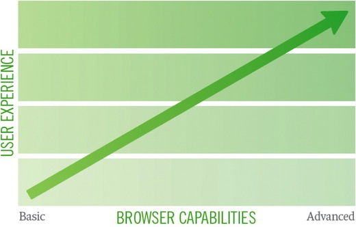
Figure 1.3: A graph of progressive enhancement.
LET’S DIG IN
The remainder of this book will take you on a tour of the various mile markers on the progressive enhancement highway, starting with markup and continuing through CSS, JavaScript and, finally, ARIA. Along the way, we’ll examine the application of progressive enhancement techniques on an event page found on Retreats4Geeks.com. By design, this book is not intended to be an exhaustive compendium of progressive enhancement techniques, so the examples will be brief and focused, exposing you to current best practices and jump-starting your use of progressive enhancement in your own work.
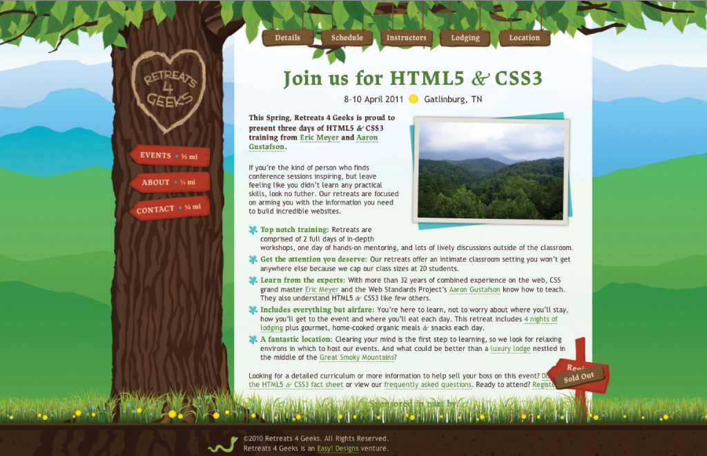
Figure 1.4: The event page from Retreats4Geeks.com that we will be dissecting throughout this book.